
Archive review: This retrospective assessment uses surviving Hirst & Hirst records and contemporary press material. It is not a claim that the product is currently stocked or newly tested.
What was it?
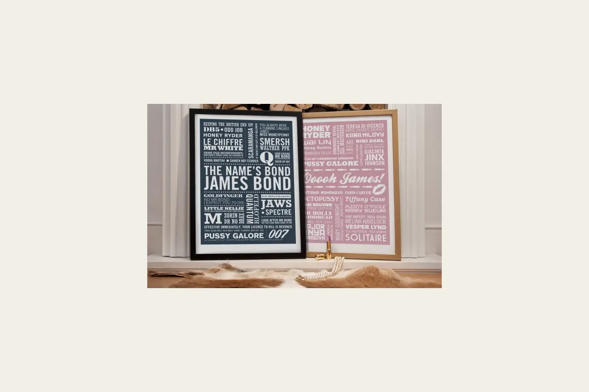
Created by Typaprint designer Stuart, the limited-edition prints gathered memorable Bond references into tightly arranged blocks of type. Hirst & Hirst promoted a black film-title design and a pink Bond-girls version during the franchise’s fiftieth anniversary.
Design and usefulness
The appeal is in recognition: familiar names and phrases reveal themselves gradually rather than through a large portrait or film still. The restrained layouts made them suitable for a home office, hall or living room as well as a dedicated film collection.
What worked
- Original limited-edition graphic design
- Strong gift for film enthusiasts
- Documented archive price
- Easy standard-format framing
Points to consider
- Condition depends heavily on storage and framing
- Licensing and edition details should be checked on resale
- Not suitable for buyers wanting official film photography
Buying or collecting one today
Ask for the edition information, inspect the paper for fading and foxing, and check whether a frame uses archival-quality backing.
Hirst & Hirst verdict
Witty, well-composed fan art that avoids the usual film-poster clichés.
Primary archive source: view the surviving Hirst & Hirst record.
Archive & sourcing note
Retrospective archive review. Hirst & Hirst no longer sells this product and has not retested a current example.
View the surviving Hirst & Hirst archive source (opens original archive).